The Light as a Regional Motif
Long before it was a heritage object, the lighthouse was a picture — painted on tiles, carved in pine, stamped into tin and pressed onto postcards. That habit is worth taking seriously, because it records something the official archive never does.
Why one building gets drawn a thousand times
Great Lakes shore communities have produced lighthouse imagery in enormous quantity and startling consistency for well over a century. The same handful of elements recur: a tapering white tower, a black lantern cap, water on one side, a low dark treeline on the other. Once you have seen a few dozen examples the vocabulary is unmistakable, and it varies far less than the actual buildings do.
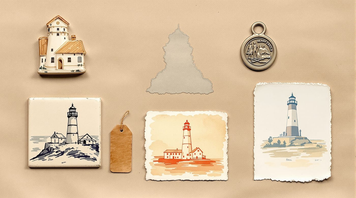
That consistency is the interesting part. These images are not attempts at accurate depiction — they are attempts at a recognisable one, and the two goals pull in opposite directions. A maker reduces the building to the smallest set of features that still reads unambiguously as a lighthouse: taper, cap, gallery rail, contrast between white shaft and dark top. Everything else — the actual masonry, the dwelling, the oil house, the whole working station — drops away.
The vernacular and the professional record
The result is that popular imagery and the documentary record preserve almost exactly opposite things.
- The official record keeps dimensions, dates, appropriations and personnel, and keeps almost nothing about how anyone felt about the place.
- The vernacular image keeps affection, association and local pride, and keeps almost nothing verifiable.
Neither is a substitute for the other, and a reader who wants to understand a light station properly needs both — the second to explain why the first was preserved at all. Buildings that people make souvenirs of tend to survive; buildings nobody draws get demolished quietly. The distinction between the two kinds of record is set out further in the station in pictures.
The lighthouse as a shorthand
By the twentieth century the lighthouse had drifted a long way from its literal function and become a general-purpose emblem — of guidance, of steadfastness, of safe return. That drift is not sentimental nonsense; it is a fair reading of what the building actually did. A structure whose entire purpose was to be visible from a long way off, in the dark, to someone in difficulty, is unusually well suited to metaphor.
It does create a hazard for anyone studying the real buildings, though. The emblem is so strong that it overwrites the specifics. Ask most people to picture a lighthouse and they will produce a tall, slender, isolated tower on a rock — which describes almost no Great Lakes station, and certainly not this one, where a fifty-one-foot tower is attached to a brick house on a low wooded shore. The gap between the emblem and the building is the subject of Great Lakes light stations.
Souvenir material as evidence
Used carefully, popular imagery does carry usable information. A dated postcard can establish that a porch, a paint scheme or a fence existed by a certain year. A run of souvenir images across decades can show when a station's public profile rose or fell. Collectors and local historical societies have often assembled better visual chronologies of a minor station than any institution holds, simply by accumulating the ephemera. Guidance on handling such material sits with the United States Lighthouse Society and with the Michigan History Center.
The caution is the obvious one: these images were made to be attractive, not accurate, and a detail that appears in one souvenir and nowhere else is a decorative invention until something else corroborates it.
This page discusses souvenir imagery as a historical category. Nothing on this site is offered for sale.